Task Tamer
AI-Driven Productivity Tool | Human-AI Interaction
Class Project - INLS 818: Seminar inHuman-Computer Interaction @ UNC Chapel Hill
Explored gamification and human-AI interaction by designing and prototyping an AI-driven productivity tool integrated with OpenAI API.
Project Overview
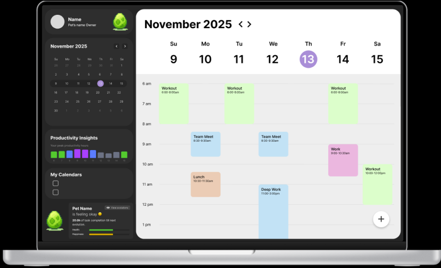
Task Tamer was a semester-long project that aimed to design, prototype, and test a gamified productivity tool that uses AI that can create an “ideal” schedule for the user. It utilizes past behaviors and patterns when it comes to schedules and task completion to make suggestions for timing and scheduling new tasks, aiming to improve productivity. Task Tamer records time spent and asks for task completion progress. These actions directly influence the growth of the user’s virtual pet, a creature that evolves as the user works towards and completes their goals. The objective of this project was to understand how gamification affects task management and productivity compared to static task trackers, what type of feedback feels most rewarding to users, and whether or not a gamified management system and an AI assistant reduce perceived load when managing multiple projects. We utilized geurilla testing methods on 6 participants, prompting participants to think aloud while moving through the prototypes. Qualiative data was collected with post-task questions as well as a post-session interview to gather feedback and constructive data. We found that users thought AI scheduling was helpful, and that the gamification aspect would motivate users to complete tasks more. Users mainly found issues with the interactivity and feedback of the prototype. Overall, we found that the gamification of producitivty tools prompted users to have increased emotional investment, supporting motivation of task completion.
This project helped me understand the importance of ensuring smooth functionality of prototypes during usability testing. While we were gaining meaningful insights, we could have understood user’s feelings better if user function wasn’t hindered by feedback issues and inconsistencies with API responses during the geurilla testing sessions.
Role:
Product Owner
Interface Designer
Usability Tester
Team:
Cindy Xu
Nathan Cavender
Timeframe:
Sept. 2025 - Dec. 2025
Task Tamer
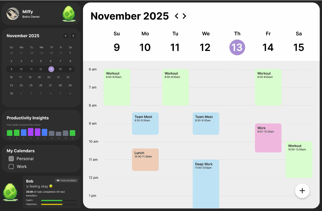
Task Tamer is a gamified productivity system designed to examine how playful interaction can support task management and habit formation. It is a scheduling system with a virtual companion whose evolution reflects users’ task completion, aiming to increase motivation through positive reinforcement and reduce cognitive load. Furthermore, Task Tamer uses AI integration to optimize task scheduling based on the user’s peak productivity times and existing schedule. This gamified approach draws from prior research in behavioral design, completion bias, and habit formation, which suggest that visual feedback and small rewards can reinforce sustained effort and reduce task avoidance. This aligns with prior research on intelligent scheduling, nudge theory, and cognitive load reduction, expanding their application into an emotionally-driven interface.
Note: Task Tamer builds upon a literature review completed for another class taken at UNC: INLS 690-089 - The Information Exposome taught by Professor Gary Marchionini. The literature review investigates the convenience versus control of online task management tools, and synthesizes research on how digital platforms shape users’ perceptions of productivity, autonomy, and information overload.
Research Questions
The goal of this project was to understand how AI-driven personalization and gamified feedback influences productivity, motivation, and engagement with an online task management system. We wanted to observe both behavioral and subjective outcomes. Thus, we came up with the following key research questions:
Gamification/Motivation: Does the inclusion of a virtual pet, and the gamified completion of tasks increase user’s motivation to complete scheduled work compared to a classic calendar?
AI Scheduling Effectiveness: How accurate and useful is the AI generated schedule for users, and do they trust the system?
Impact on Procrastination: Does Task Tamer help users procrastinate less or complete tasks as planned more than they normally would?
User Schedule Discipline: To what extent do users follow the AI schedule and the value the generated sidebar suggestions?
Limitations: What are the limitations of the system, and what improvements has testing shown the need for?
Research Methods
We employ a mixed-methods usability evaluation centered on the Task Tamer prototype. The study aimed to understand how users interact with the system’s planner interface, AI-generated task recommendations, and digital pet feedback loop. Due to time limit constraints, we decided to use geurilla testing methods in order to gather quick but valuable data on our initial
A more in-depth test plan can be found linked below.
Usability Tasks
For our usability test session, we created four usability tasks, which directly correlated to our evaluation goals and findings from our heuristic evaluation. We wanted to test and see if our evaluation findings correlated with user findings.
Task List
Identify which year Sri Lanka had the highest primary forest loss.
Compare “Tree cover loss” and “Forest greenhouse gas emissions” in Brazil. Make any adjustments (i.e., lower the opacity) to the layers you think will help make it easier for you to interpret the overlap. What do you observe about the two layers?
Draw a shape on the map around the Maldives, including Male and Addu City, and find what biome the area is part of.
Find the number of “Highest confidence detection by multiple alert systems” for “Integrated Deforestation alerts” in Brazil from 2023 to 2025.
Findings
Once we were finished conducting our four usability tests, we then analyzed the data we gathered, with a focus on both qualitative and quantitative data, wanting to triangulate by cross-referencing performance data, self-reported difficulty, and observational insights to form a comprehensive understanding of usability challenges and user experience trends. We identified common themes with issues across our participants including unclear system visibility and lack of customization that iterferred with participant’s ability to complete tasks.
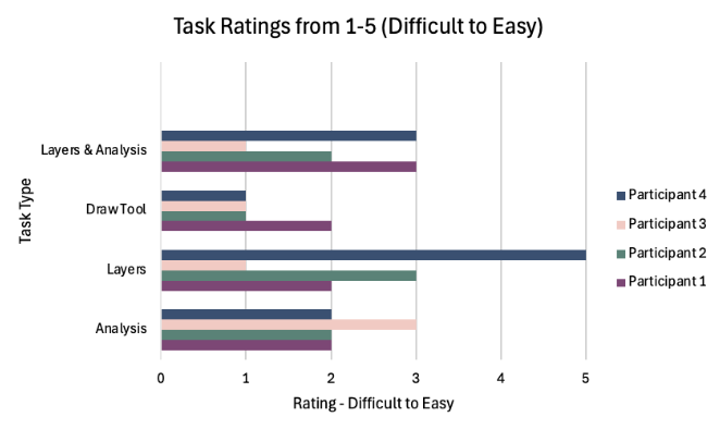
Task Difficulty
Participants found tasks to be moderate to high in difficulty. Most participant task ratings were ≤ 3, indicating they weren’t easy. Analysis and Draw Tool tasks had the most ratings between 1 and 2, indicating that these tasks were perceived as the most challenging. P4 stood out: while they also rated most tasks as somewhat difficult, they found the Layers task significantly easier, giving it a 5. Overall, the trends suggest that core interactions in Global Forest Watch pose usability challenges for many users
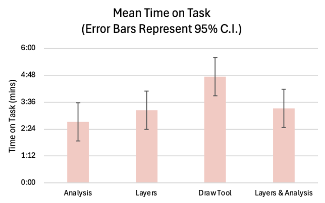
Time on Task
The Draw Tool task took the longest overall, averaging right under 5 minutes, suggesting high complexity and greater variability in user approaches to the task. Analysis was the quickest task, averaging around 2.5 minutes. The Layers and Layers & Analysis tasks fell in the middle, each averaging around 3 minutes. These patterns suggest that tasks involving creation (like drawing) introduced more cognitive load, while data exploration tasks were quicker and more straightforward for most users.
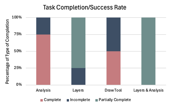
Task Complete/Success Rate
Analysis task had a strong completion rate, with 75% of attempts fully successful. The Layers and Layers & Analysis tasks showed the highest levels of partial completion, suggesting that participants understood the general workflow but struggled with specific details required to fully complete the tasks. The Draw Tool task produced a more mixed outcome: 50% of attempts were complete and 50% incomplete. Results suggest that tasks with layer management and multi-step analysis require clearer guidance and creation-based tasks (like drawing) also presented barriers to full success.
Participants struggled to find key tools.
3 out of 4 participants had difficulty locating the “Analyze” tool that is the main function of the system that allows users to view in-depth forest data and information.
The Draw Tool task took the longest among participants to complete, averaging right under 5 minutes for completion, with the largest hinderance being able to locate the tool in the first place according to think aloud notes, leading to only 2 out of 4 participants completing the tasks.
2. Participants were unable to customize their view, inhibiting user function.
The Layer Comparison task elicited the most points of confusion and frustration due to lack of system visibility and customization to improve visibility.
The Timeline task was difficult for users to navigate due to the need to naviagte between the Legend and Analysis tab in order to see system updates, leading to 4 out of 4 participants partially completing the task.
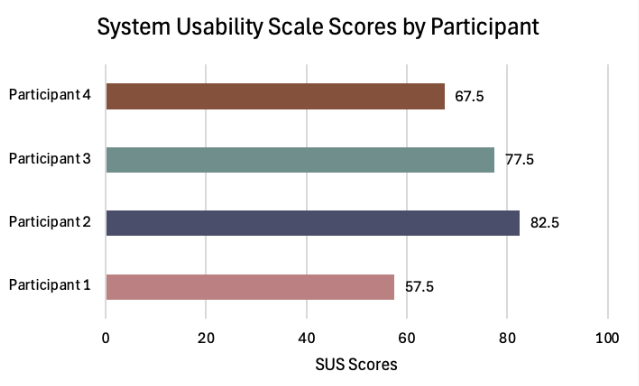
System Usability Scale
Our post-session questionnaire was a System Usability Scale questionnaire. We calculated the mean responses and calculated an average SUS score of 71.25. To put this into comparison, any score of 68 is considered "average.” However, it is notable that one participant gave a rating of 57.5, falling below below the typical cutoff for acceptable usability. These results indicate that though individual differences highlight opportunities to improve user experience, most users perceived the system as usable.
Avg SUS v. Avg GFW SUS
Design Recommendations
After our analysis, we provided several UX recommendations in an attempt to improve the usability of GFW’s website. We supported these suggestions with quotes taken from participants’ think aloud sessions along with visual representations on our recommendations in our slide deck. In the end, we came up with three major design recommendations for GFW:
Layers
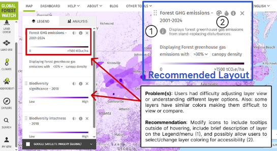
Problem: Layers have unclear descriptions, options, and coloring.
Recommendation: Clarify layers with text descriptions. Allow for further user customization: color, opacity, etc. This improves usability and accessibility (improving color contrast).
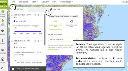
Analysis Tab
Problem: Separation of the Legend and Analysis tabs results in the Analysis features being less used and heavy cognitive load when switching between the two.
Recommendation: Allow users to view both tabs at once to update layer settings and view visualizations concurrently. Tabs could be collapsable.
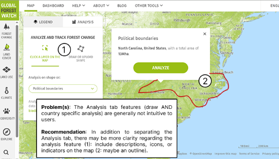
Shape Analysis
Problem: The Analysis tab features are hidden with unclear descriptions.
Recommendation: Clarify what the features do and how to use them. This includes: Descriptions, Icons, or UI indications (i.e., on the map).
Project Takeaway
This project was one of the most comprehensive, and ultimately most rewarding, experiences of my graduate program. Working through the full lifecycle of the study pushed me and my team to engage deeply with the details of usability test design, from how the moderator greeted participants to where they were positioned in the room. Attending to these seemingly small decisions strengthened my research practice, which I believe have strengthened my skills as a researcher.
One of the most significant challenges we encountered was learning when to intervene and when to step back during sessions. We were constantly navigating the tension between supporting participants and allowing them to struggle productively. This experience sharpened my ability to recognize when participant errors were generating meaningful insights versus when they were creating unnecessary cognitive burden. Learning to make these judgment calls in real time was a pivotal growth moment for me as a researcher, and has since informed how I design, moderate, and reflect on user studies.